Posts

FINAL

Image
  Putting together my portfolio was fun. To see all of my projects that I did not think I could do was pretty cool. My favorite projects were the somewhere and the propaganda. I think I preformed the best on those and putting the portfolio took me about three hours. It was difficult to get things the way I wanted, but in the end I really like how it turned out! 

Cards

Image
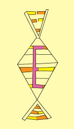
  Making a business card in college is something I would never see me doing. It was my first time doing anything like this, like most projects in this class. I thought it was easy and fun. I like to keep my designs simple and I am not a fan of intricate designs, so when designing my cards since my logo is complex shapes i decided to keep a plain colored background that benefits my logo and makes it stand out. My logo is a simplified version of human DNA. I used different colors to represent the different aspects of DNA. Then I used color theory to relate what they mean in my life. In all I thought the project was fun and I like how my cards turned out. 

B/W TO COLOR

Image
 I really enjoyed creating this project. I thought it was fun and easy. I chose a picture of me with a cool background. It was from a wall in  Bryson City, North Carolina. I chose different colors by using the adobe color wheel. 

TAG BRUSH

Image
 When creating my tag brush I took my logo and added some features to make it a tag brush. It was not my favorite project but it was easy to me. The tag brush is ok it does not appeal that much to me but I like more softly colored pictures and art rather than hard lines. 

LOGO

Image
 For this project we made our own logo. I really enjoyed this because I got to pick a symbol that has significance to me and I got to incorporate myself into it. i chose three different colors, two for the amino acids and a color for my letter to make it pop. I really like this project but it did take some time for me to make the logo since I had no experience. it was a complex design but I tried to take my time to make it look good.

ID HW 1

 Three videos I found for In design for beginners was, " get started with 10 beginner tips for in design." This video was only 14 minutes and and brushed on tips and tricks for certain projects. I thought it was only helpful a little bit and it didnt go into great detail about tools. For a beginner who doesn't do much with digital media design I think it would be more beneficial to take a course or watch a video describing each tool and how to use it.  https://www.youtube.com/watch?v=mVW8AF2TMnw The next video I picked was called, " in design for beginners FREE COURSE." I thought this video was great it went through all of the tools and different ways to use them to get the desired look. As an individual who has never used in design I liked this course and obviously appreciated that it was free. This video was around 2 and a half hours.  https://www.youtube.com/watch?v=RXRT3dHu6_o The last video I watched was a 5 minute video called, " adobe in design tutor

Somewhere project

Image
 I have minimal experience with photoshop but I remember doing this in high school in my digital media class. So, when I found out we were doing this project I was excited because I knew what to do. For the somewhere I chose a friends episode where they are sitting on the couch in central perk. Not only did I pick this scene because I watch Friends everyday but because my mother actually named me after Ross and Rachels baby, Emma.  I found this project easy but there was a few bumps in the road. The main thing I had issues with was trying to blend my body into the background while making sure it looked natural. I have an eye for small detail so I took the time to make sure I was as blended in as possible.  The before:  Me before:  Completed: